10 Fun & Easy Ways to Create Gorgeous Color Palettes For Your Coloring Books & Pages
All the positive hype about coloring is 100% true—it’s relaxing, it’s creative, it’s therapeutic, it’s entertaining, and it’s the rare artsy hobby that is as enjoyable to do in a group as it is on your own.
But, let’s be honest: selecting a color palette to color with is…well, an interesting mental challenge at its best and a totally paralyzing, soul-crushing creative nightmare at its worst.
After a lifetime of coloring (I was permitted crayons shortly after turning 2 years old, and haven’t looked back), even I find the process of selecting a fresh color palette for a brand new coloring page a bit daunting from time to time, especially if I’m turning to coloring for stress or anxiety relief. When these moments of color-selection overwhelm arise inside of me I lean on a number of color palette generating strategies to help jump start my creativity and get my brain focused on actually coloring rather than worrying about choosing “the right colors.” Some of these strategies are super quick and simple (guaranteed to be crowd pleasers) and some of them are a bit more wild and complicated (and might be head scratchers to some of my readers), but I thought it was high time that I pulled them all into a detailed blog post for y’all so you could start playing around with them on your coloring pages, too.
Without further ado, here are my top 10 color palette generating strategies for your coloring pages, organized from simplest to wildest!
*Any links to supplies in this post found on Amazon or Blick Art Materials are affiliate links. Should you decide to bring home an art tool I’m talking about and purchase it through the links found here, a few pennies of that purchase are distributed to me. It isn’t much, but it (slowly) adds up—it’s a lovely way to support the content that I create, and it comes at no cost to you, which is awesome, too. Thanks, in advance, to anyone who supports my art in this way; I really appreciate it!
1. Grab & Go - No Peeking!
This is THE simplest and most effective color palette selection strategy I know of. Added benefit: it just feels good to plunge your hand (or hands if you’ve got a really big collection of colored pencils/markers) into a bin of art supplies and grab stuff! Plus it sounds awesome too, especially if you are digging your open fingers into a bucket of crayons! This palette generating method is perfect for when I’m in a “I just can’t even” mood and making decisions about what hues I want to color with feels like just one. more. thing.
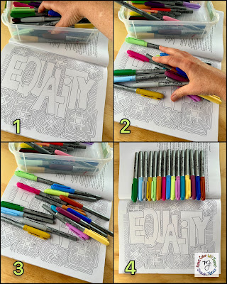 |
| I have wanted to color this page from Feminism Is For Everyone for quite a while now but felt a little overwhelmed by making that first color choice (I love drawing patterned coloring pages but I actually find coloring them a little intimidating). The crazy color palette I pulled out for the sake of this blog post photo actually really spoke to me, and I when I next sit down to some feminist coloring (which will be soon—I’m completely disgusted by the SCOTUS ruling on Roe v. Wade from this past Friday, and I need a healthy place to put all my rage & fear), this page & palette is what I am going to explore. |
Oddly enough, once I’ve grabbed and gone with my art supplies and I see a collection of colors splayed out before me, my brain always perks up a bit and is able to make a decision about which colors I don’t want in the group. When I’m emotionally exhausted or creatively blocked, deciding what I don’t want (in essence, saying an emphatic “No!” to something like a toddler rather than a polite “Yes!” like a grownup) is ridiculously easy and, dare I say it, fun. That is why I love this color palette selection method so much.
2. Follow Strict (but simple) Limitations.
Limitations, in my opinion, are an artist’s best friend! Sure, creative folks are perceived as being all about rule breaking and out-of-the-box thinking, but the right kind of rules give your creative time a fun structure to play within, and yes, even break out of; it feels just as awesome to break your own rules as it does to break more traditional ones!Having too many options (ie. color choices, art supplies, even coloring pages) when you sit down to color leads to only one thing: the paralyzing overwhelm. To avoid that feeling, I lean on simple limitations (also known as constraints) to jump start my creativity and get me coloring.
Artistic limitations come in all shapes and sizes (and in fact just the idea of having a specific color palette to color with is itself an example of a limitation!), but here are a two of my favorites that I use all. the. time.
ROYGBIV (aka the rainbow palette)
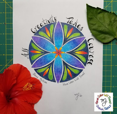 |
| Would you be able to say straight away that this mandala was colored in the ROYGBIV spectrum? Just because you love coloring in rainbows (which I unapologetically do) doesn’t mean that you have to follow strict rules about color placement! I colored this mandala (which I also drew) as the final project example for my online class Colored Pencil Blending Techniques. I haven’t offered the course in quite a while, but if you are interested in learning how to blend basic colored pencils like a pro (you can use whatever colored pencils you have, and I teach all the techniques using a basic Crayola 12 ct set) do let me know via this form! |
Warm or cool colors only
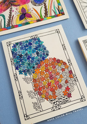 |
| Traditional cool colors are BLUE, PURPLE, & GREEN. Traditional warm colors are RED, YELLOW, & ORANGE. But, like all good traditions there are colors that break those rules. There are warm greens, cool reds, and everything in between. The best way to figure out if a color is warm or cool is to place it next to one that you’re sure of (say a brilliant yellow for warm and a sea blue for cool) and compare. I find this an interesting activity (it is what I was doing with this colorable card from my Wildflower Wanderings collection) that leads to beautiful coloring art. |
3. Think Monochromatically.
What’s easier than choosing a single hue to color with? Um…nothing, really! The challenge when coloring monochromatically is not in palette selection but in deciding where to put the different shades, tints, and tones of that chosen color on your coloring page. This is a much simpler decision making process because there’s always a limited number of black lined spaces to choose from on a coloring page, so that yucky “I’m overwhelmed” feeling never shows up.
It may seem like this style of palette selection could only be possible if one was coloring with an enormous set of colored pencils, markers or crayons, the kind of collection that comes with 25 different greens, blues, reds, yellows, purples, and oranges. But I colored the colorable bookmark below with only a 12 count set of Crayola colored pencils, so please know that it is possible to go monochromatic on a budget, especially if you’re willing to break your own color palette rule of staying monochromatic and utilize your white and black colored pencils (ooh, why not go crazy and throw in a simple #2 pencil into the color mix?) to tint and shade your chosen color!
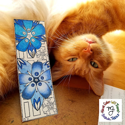 |
| Monochromatic coloring is a fascinating way to create coloring art! The more you know about tinting, shading, and toning your basic colors, though, the more fun it is to color monochromatically. I also teach a course called Monochromatic Coloring (it is a livestream virtual course using only a 12 ct set of Crayola colored pencils). I haven’t offered it in a while, but if learning to take your coloring further in this way sounds fun, do let me know by emailing me here! I use my colorable bookmarks in this class because it is lovely to finish a course and have a useful bit of coloring art to show for it! |
4. Use A Single Coloring Supply Set.
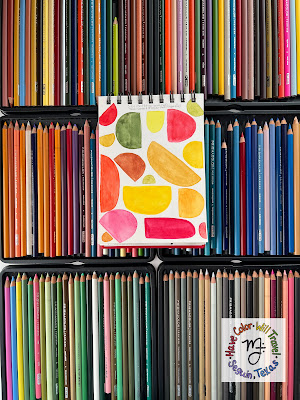
This may be my favorite way to color on this whole list! When I opt to color like this, I make sure I select a relatively small set of pencils, markers, crayons or, as in the case of the photo below, paint (a collection that has no more than 36 colors in it), and then have at it.
Within a single, small set of coloring supplies there are easy-to-break-down color groups—the purples, the browns, the greens, etc.—mini color palettes all set up for you to use. Choosing colors feels easier when coloring with a set like this, especially if you take the time to arrange your colored pencils or markers into color families, always a quick and pleasant task with a 12-36 ct set, in my opinion.
It is exciting to have the larger, more comprehensive sets of colors (like the 150 Prismacolor Premiere or the 120 Faber-Castell Polychromos sets), but all those choices…well, they can be distracting, and not in a good way. I’m an art supply nerd (read: hoarder), so I do have those larger sets, BUT when I sit down for a relaxing coloring session just for me, I rarely bring those gargantuan sets to my art table. Why? The overwhelm hits me every time when I look at all those trays full of different colors (so many that they take up the entirety of my art table), and the next thing you know the time I had to color has flown by, and I’ve barely colored in a single space! When my goal is to have an enjoyable coloring experience, I pull down one of my small sets of colors, and I have yet to find this decision disappointing!
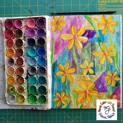 |
| If you’ve not yet tried to play with watercolor paint in your coloring books what are you waiting for?! I love to watercolor in my adult coloring books (it does no work well in traditional coloring books, the sort that are printed on newsprint-colored paper), which is why I print all of my smaller coloring adventures on hot press watercolor paper rather than card stock (card stock, even thick, high poundage paper, does NOT like to play with water). When watercolor painting in your adult coloring books I find it best to use a stiff nylon paintbrush and pan watercolors like you see in the above photo (this is an ancient set of Angora watercolors I’ve had since I was a teenager) as both these things help you with your water control. When watercoloring in adult coloring books you MUST use water sparingly! Too much water on your coloring book paper will cause it to degrade and tear. Pictured here is a watercolored page from my first coloring book Doodled Blooms. |
5. Color For A Cause.
I love adding hidden (or not so hidden) messages to my color palette choices! If you’re passionate about something I guarantee that your cause has chosen colors to represent its community. A quick Google search will find that palette information, and then all that’s left for you to do is use those colors (and your activistic passion) creatively!
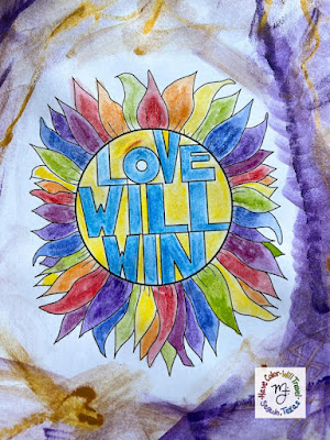 |
| I created this colorful mess on camera in my recent Coloring Together session on YouTube. In the last few months I have felt all the passionate feelings about the war in Ukraine (in the center are the colors of the Ukrainian flag), Pride month (notice the ROYGBIV petals), and women’s rights (purple, gold, and white are historically the colors of the American women’s movement, so I smooshed those colors everywhere else), so to test out the properties of my new Stabilo 3-in-1 Woodies, I colored for all the causes that have been heavy on my mind. The end result is a wild, colorful chaos, and I love it! |
6. Crowd Source Your Color Selection!
This option is super fun and crazy easy: ask your friends, family, coworkers what colors they think you should use on your coloring page! Not everyone loves to color (still, I stand firm that coloring IS for everyone, regardless), but you know what absolutely everyone does love to do? Folks LOVE to share their opinions about color choices! Query your crowd about your color palette question on social media, in person, via text (ooh, even an actual phone call would work), take notes about their responses, and then see what you can come up with using their suggestions!
Be warned though: while this method of color palette selection may be easy, it does come with a bit more risk than the other nine options. It’s entirely possible that folks could enthusiastically suggest colors you can’t stand, leaving you with a bit of a tender choice—do you thank them and stick with their colors suggestions even though they make you uncomfortable, OR do you tell folks who’ve just generously shared their color ideas with you “thanks, but no thanks?” I love querying the crowd for color suggestions, so my advice if you get stuck in this type of scenario is to just look at those colors and say to yourself “Challenge accepted!”
Oh, and don’t forget to share your finished coloring art with the folks who gave you their color palette opinions; it’s an absolutely delightful experience for them to see their color ideas brought to life and for you to receive their warm compliments on your creative endeavor.
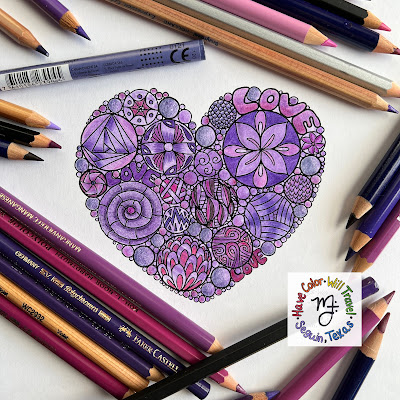 |
| This past February, I queried the crowd on social media for color palette suggestions to create a bunch of Valentines with my Love Is Love colorable cards. It was an amazing experience for me, and I wrote all about it in this blog post. Side note: I’m not a fan of purple but I am thankful I went with a friend’s suggestion to “Go purple!” because I think this Valentine turned out stunning!💜 |
7. Use The Procreate Palette Generator.
If you’ve got Apple technology in your life and a spare $9.99, Procreate is a powerful, wonderful creative tool to add to your artsy treasure chest! Yes, it’s fabulous for creating original digital art and it is super fun to color digital coloring pages with, but Procreate is also a handy tool for making crazy-cool IRL coloring palettes from your very own photos and environment!
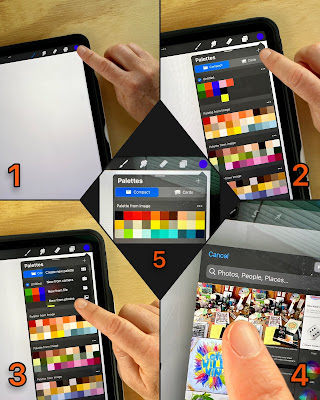
The photo below details step-by-step how to create a Procreate color palette from a photo already in your photo library (I chose a super chaotic photo of my art table that I took with my phone and then Airdropped to my iPad). But you can also take a photo inside of the Procreate app that it will then morph into a color palette of swatches. I find taking photos with my iPad super awkward, so when I see a color palette I love out and about—for example, a gorgeous sunset, a well decorated room, a field of flowers—I always take a photo of that palette inspiration with my phone and then send it to Procreate later to make a collection of color swatches.
Once Procreate has generated the color palette, all that’s left for you to do is to match the colors Procreate pulls together to the art supplies you are going to color with! The app can even provide you with a color palette that uses actual color names rather than little squares of color, which is quite helpful. That view of a color palette is much larger, though, so for this blog post I opted to share with y’all the example of the condensed palette style (the center photo, labelled #5)
8. Pretend Your Eyes Are Procreate!
Don’t have Procreate? No problem! Our human eyes are just as good at matching the colors in photos to the coloring tools on our desks as machines…only not as speedy!
Once you have an image or item that has a bunch of colors you love in/on it (say a page from a magazine, a photo on your phone, the decorations on a bit of fabric, the cover of a book, etc.), simply place that image or item on or really near by your coloring supplies and begin the matching process. Once you feel like you’ve found matches in your colored pencils, markers, crayons or paint to the colors in your chosen image or item, put away all the rest of the art supplies (so they don’t distract you) and get coloring!
9. There’s An App (or two) For Creating Color Palettes, So Let’s Use Them!
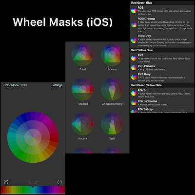
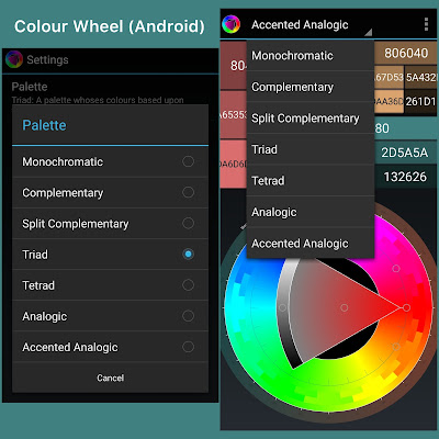
If you’re looking to start playing around with colors that are outside of your wheelhouse BUT you’re still really intent on your coloring art having a truly harmonious look to it, both iOS and Android have apps for that!
Wheel Masks (for iOS) is more functional than Colour Wheel (the app I used when I had an Android phone), but they both are super fun to experiment with when you’re in the mood for color play! Added benefit: these apps are entirely FREE and use standard RGB and Hex color value codes when you go to export (Wheel Masks) or screenshot (Colour Wheel) the palette you’ve created for your coloring project.
Once you’ve created your color palette using these apps, all you need to do is match your art supplies to the tints, shades, and tones the program generates for you and then get coloring!
10. Gamify Your Color Palette Selection.
Okay, I gotta be honest with y’all: until I started talking about this article with my son, Samuel, this week (he has just graduated college and is spending a few weeks at home before heading off to graduate school in San Francisco), I had only NINE color palette generating ideas to share with y’all. Number ten is all Sam’s idea, and I think it’s absolutely brilliant!
Here’s the idea:
- Pull out some dice (this is easy to do if you live with gamers like I do, but if you live a dice-less life, https://rolladie.net/roll-2-dice is a handy website that provides you with virtual dice rolls all the way up to a D100!) your coloring page, and a set of coloring tools that lie fairly flat (this palette selection strategy won’t work very well for a bucket, can, or jar full of coloring supplies).
- Roll your dice, and based on the number you rolled, count through your colors until you get to that number (ex. you roll a 10, count over ten colored pencils, and when your finger lands on the tenth one, that’s the color you pick up!).
- Continue to roll, count, and pick up pencils, markers, or crayons until you have a nice collection of colors (personally I would stop somewhere between 10 to 15 colors).
- Clear away the rest of your coloring supplies so they are not a distraction to your gamed color palette.
- Get coloring!
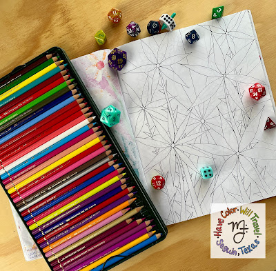 |
| I haven’t had the opportunity to play with Sam’s color roll palette generating idea yet, but when I do it is gonna be with my favorite page from my first coloring book Doodled Blooms. I plan to use one of my fellas’ D20 dice (a die that has 20 different sides) because I want to use ALL the colors on this spiky floral illustration! |
Of course you may not like the colors the dice rolls select, in fact the odds are probably good that you won’t! If that is the case, you have two options: roll again (this is YOUR coloring game, so you get to decide the rules) and keep rolling until the dice give you a color you’re happy with, or (and this is the option I find the most interesting) trust the dice, keep all the colors chance offers to you, and see what sort of coloring art you can make with the hues that don’t make your heart sing!
I think this method of color palette selection would be super fun to experience in a group setting (ooh, and you could also switch color palettes every 15 minutes with the person on your right—color palette speed dating!). It would also be a fabulous strategy for helping young children share popular coloring supplies, Help the children in your care roll the dice and split the coloring tools (who can complain that a dice roll is unfair), and after a few minutes or so they can swap color palettes with their sibling so everyone gets time with the most popular colors (why boxes of crayons don’t come with more than one black and white I will never know!).
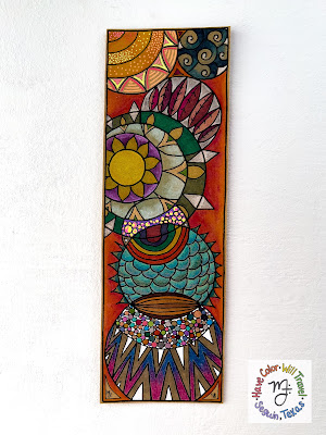
And there you have it—10 crazy-fun methods for generating color palettes for your coloring pages! Personally, when I color I tend to separate a coloring page into a visual sections (it is fairly easy to do this with most colorable illustrations) and then use a different palette generating strategy for each one (I love bringing all the “extra” to my coloring time). The photo below is of one of my colorable bookmarks (printed on Kraft-colored card stock) that I colored years ago. I created this coloring masterpiece with not one, not two, but FIVE of the color palette generating methods I shared with y’all in this blog post! Can you guess which ones (answer is in the photos caption)???
Now that you’ve got my top 10 color palette generating strategies at your fingertips, which ones are you excited to try out on your next coloring adventure? Let me know in the comments of this post OR tag me in the coloring art you create and post to social media ( @havecolor_willtravel on Instagram and Have Color Will Travel on Facebook). I would love to see how you bring these palette creation ideas to life in your coloring books!
Happy coloring, y’all!!🌈

Comments
Post a Comment